Note
Go to the end to download the full example code.
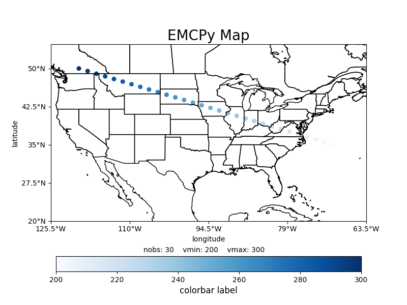
Scatter Map Plot#
Below is an example of how to plot scatter data on a map plot using EMCPy’s plotting method.
import numpy as np
import matplotlib.pyplot as plt

from emcpy.plots import CreatePlot, CreateFigure
from emcpy.plots.map_tools import Domain, MapProjection
from emcpy.plots.map_plots import MapScatter


def main():
    # Create test data
    lats = np.linspace(35, 50, 30)
    lons = np.linspace(-70, -120, 30)
    data = np.linspace(200, 300, 30)

    # Create scatter plot on CONUS domian
    scatter = MapScatter(lats, lons, data)
    # change colormap and markersize
    scatter.cmap = 'Blues'
    scatter.markersize = 25

    # Create plot object and add features
    plot1 = CreatePlot()
    plot1.plot_layers = [scatter]
    plot1.projection = 'plcarr'
    plot1.domain = 'conus'
    plot1.add_map_features(['coastline', 'states'])
    plot1.add_xlabel(xlabel='longitude')
    plot1.add_ylabel(ylabel='latitude')
    plot1.add_title(label='EMCPy Map', loc='center',
                    fontsize=20)
    plot1.add_colorbar(label='colorbar label',
                       fontsize=12, extend='neither')

    # annotate some stats
    stats_dict = {
        'nobs': len(np.linspace(200, 300, 30)),
        'vmin': 200,
        'vmax': 300,
    }
    plot1.add_stats_dict(stats_dict=stats_dict, yloc=-0.175)

    fig = CreateFigure()
    fig.plot_list = [plot1]
    fig.create_figure()

    plt.show()


if __name__ == '__main__':
    main()
Total running time of the script: (0 minutes 0.733 seconds)