Note
Go to the end to download the full example code.
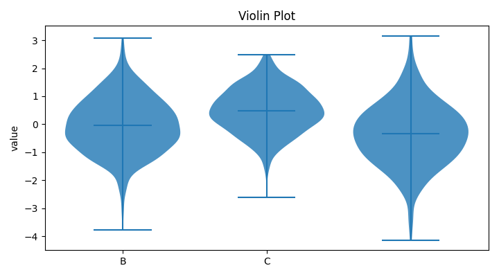
Violin Plot#
Distribution comparison using ViolinPlot.
import numpy as np

from emcpy.plots.plots import ViolinPlot
from emcpy.plots.create_plots import CreatePlot, CreateFigure

rng = np.random.default_rng(0)
n_samples = 400
groups = [rng.normal(0.0, 1.0, n_samples),
          rng.normal(0.5, 0.8, n_samples),
          rng.normal(-0.3, 1.2, n_samples)]

p = CreatePlot()
layers = []

vio = ViolinPlot(groups)
vio.showmedians = True
vio.alpha = 0.8
layers.append(vio)

p.plot_layers = layers
p.add_title("Violin Plot")
p.add_ylabel("value")
p.set_xticks([0, 1, 2])
p.set_xticklabels(["A", "B", "C"])

fig = CreateFigure(1, 1, figsize=(7.2, 4))
fig.plot_list = [p]
fig.create_figure()
fig.tight_layout()
Total running time of the script: (0 minutes 0.068 seconds)