Note
Go to the end to download the full example code.
Creating a Scatter Plot with a Regression Line#
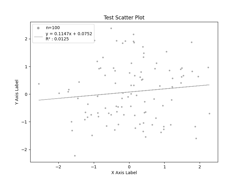
The following is an example of how to plot data as a scatter plot and include a linear regression line. Calling the linear regression function will give the user the y=mx+b equation as well as the R-squared value if the user specifies a legend.
import numpy as np
import matplotlib.pyplot as plt

from emcpy.plots.plots import Scatter
from emcpy.plots.create_plots import CreatePlot, CreateFigure
from emcpy.stats import get_linear_regression


def main():
    # Create test data
    rng = np.random.RandomState(0)
    x = rng.randn(100)
    y = rng.randn(100)

    # Create Scatter object
    sctr1 = Scatter(x, y)
    # Add linear regression feature in scatter object
    sctr1.do_linear_regression = True
    sctr1.add_linear_regression()

    # Create plot object and add features
    plot1 = CreatePlot()
    plot1.plot_layers = [sctr1]
    plot1.add_title(label='Test Scatter Plot')
    plot1.add_xlabel(xlabel='X Axis Label')
    plot1.add_ylabel(ylabel='Y Axis Label')
    plot1.add_legend()

    # Create figure
    fig = CreateFigure()
    fig.plot_list = [plot1]
    fig.create_figure()

    plt.show()


if __name__ == '__main__':
    main()
Total running time of the script: (0 minutes 0.068 seconds)