Ctrl+K

EMCPy

  • Get started
  • Explanations
  • Contributing
  • Plot Types
  • Examples
  • GitHub
  • Get started
  • Explanations
  • Contributing
  • Plot Types
  • Examples
  • GitHub

Section Navigation

  • Line Plots
    • Creating a Skew-T Log-p Plot
    • Dual y-axes (twinx)
    • Error bars & shaded confidence band
    • Invert log scale
    • Line Plot Options
    • Line styles & legend outside
    • Log and symlog scales
    • Plotting multiple lines on a single plot
    • Datetime axis with monthly majors and weekly minors
  • Statistical Plots
    • Box vs Violin
    • Hexbin vs 2D Histogram with Colorbars
    • Histogram with KDE Overlay
    • Layered histograms
    • Scatter with Linear Regression Fit
  • Gridded Plots
    • Discrete filled contours
    • Filled contours with line overlays
    • Pcolormesh
    • Two panels with one shared colorbar
  • Map Plots
    • Create a custom map domain
    • Plotting contours on a map plot
    • Filled contours (Lambert CONUS)
    • Global gridded (PlateCarree) with coastlines
    • Creating a map plot with no data
    • Plotting 2D scatter data on map plot
    • Map scatter (basic)
    • Map scatter (integer categories)
    • Overlay: filled contour + contour + scatter
  • Examples
  • Statistical Plots

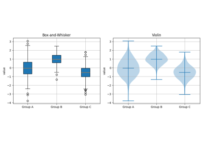
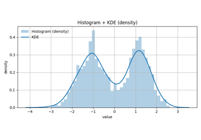
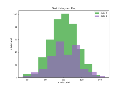
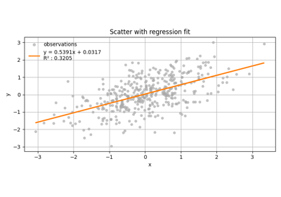
Statistical Plots#

Box vs Violin

Box vs Violin

Hexbin vs 2D Histogram with Colorbars

Hexbin vs 2D Histogram with Colorbars

Histogram with KDE Overlay

Histogram with KDE Overlay

Layered histograms

Layered histograms

Scatter with Linear Regression Fit

Scatter with Linear Regression Fit

This Page

  • Show Source

© Copyright 2025, NOAA/EMC.

Built with the PyData Sphinx Theme 0.16.1.